
UI Redesign Project
The semester-long project for INF 385T: Visual Design was to conduct a heuristic evaluation of a web or mobile application and to then redesign the UI based on our findings including multiple iterations and peer-to-peer feedback.
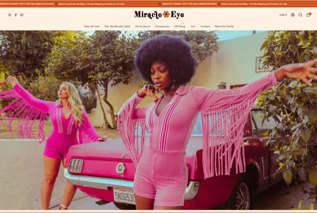
Home Page of the Miracle Eye website
Choosing a Project
I chose to evaluate "Miracle Eye," a vintage-inspired and family-run clothing boutique from Los Angeles, California.
I often find myself inspired by vintage and vintage-inspired art and décor, so this small business was a perfect subject for my interests. Additionally, I chose to focus on a web-based project rather than a mobile app because my background is in front-end web development for web applications.
Heuristic Evaluation
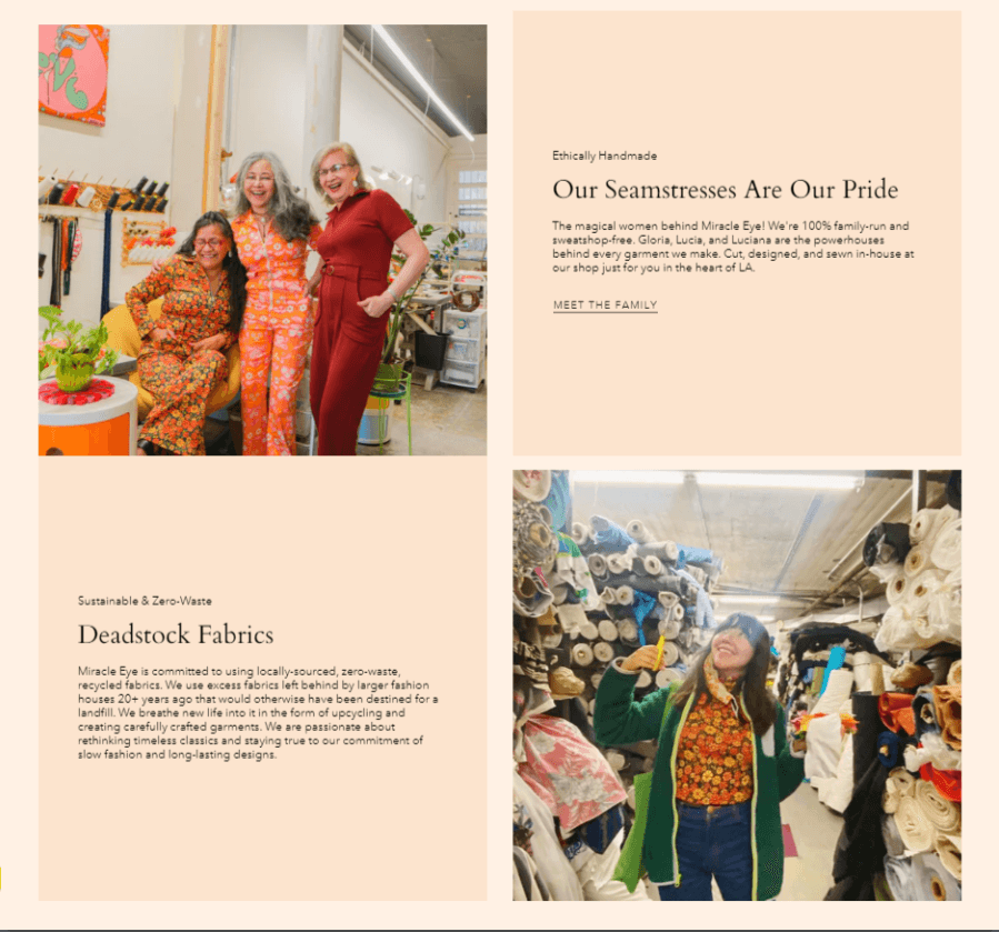
Flexibility & Efficiency of Use
This website has some layout choices that make it a lot more difficult to navigate than it would be with a bit better organization. For example, there is biographical information about the small business scattered throughout the website (including on the individual product pages).
While the information is important to the identity of the brand, it would be better served in a dedicated "About" page where users would expect to find it.
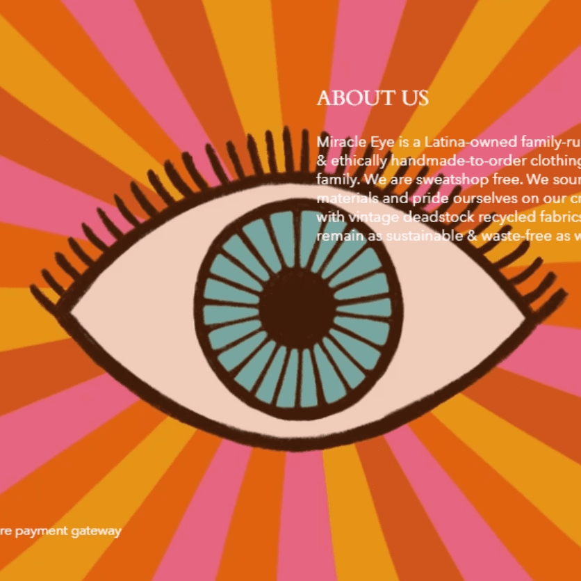
Accessibility
There are a couple design choices that may make the website difficult for low vision or colorblind users to access.
One example of this is the footer that is present on every page. The background image is very colorful and the color of the font overlaying it is white. Because of this, on some screen sizes, the font overlaps with the different colors in a way that is very hard to read.

Consistency & Standards
This website has some issues with format consistency. For example, the home page has three different types of menu for the different categories of items they sell (pictured above). This makes the website a lot busier than necessary and a bit difficult to traverse.Additionally, there are a few places, like the "Meet Us" and "About Us" pages, were the font hierarchy doesn't match up with the other pages on the website.
Iterative Development
First & Second Iterations
Third Iteration
Fourth Iteration
Final Prototype
Final Iteration
During the final development iteration, I added on a few extra pages to make my prototype more robust, including a confirmation page for submitting payment at checkout, a confirmation page for submitting a product review, and an extra page to show what a dropdown menu on the top navigation bar would look like.
In this step, I also fully completed my prototype and linked all pages together with what click interactions should lead to which pages.
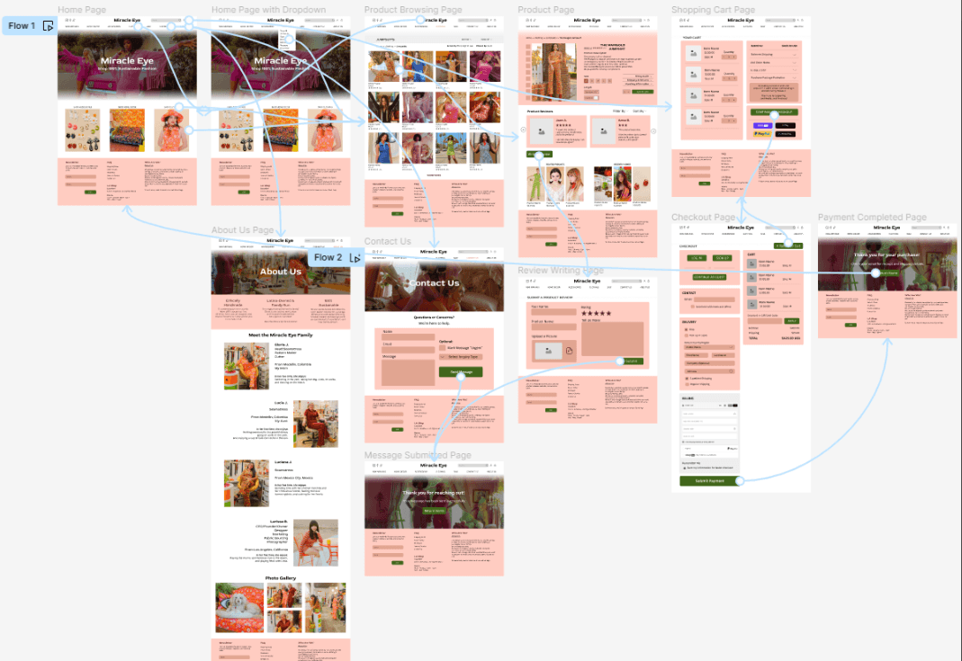
Prototype flows
Demo video of heuristic evaluation and final prototype